
Crafting a Native Loyalty App for iOS & Android
In the world of mobile banking, a seamless and tailored app experience across both iOS and Android is critical for customer satisfaction. Designing a Loyalty Rewards app that leverages the strengths of each platform poses unique challenges for designers. In this project, I'll share insights gained from creating a cohesive banking loyalty program app and discuss how I aimed to maintain brand consistency while respecting the distinct nuances of each operating system
Introduction
This project's goal wasn't to create an app that looked and felt identical on iOS and Android. Instead, the focus was on delivering a core loyalty experience that felt intuitive and enjoyable while respecting established patterns on each platform. For example, while the color palette remained consistent, component styles like buttons subtly reflected the conventions of each operating system - rounded on iOS, slightly beveled on Android.
Establishing a Shared Design Foundation
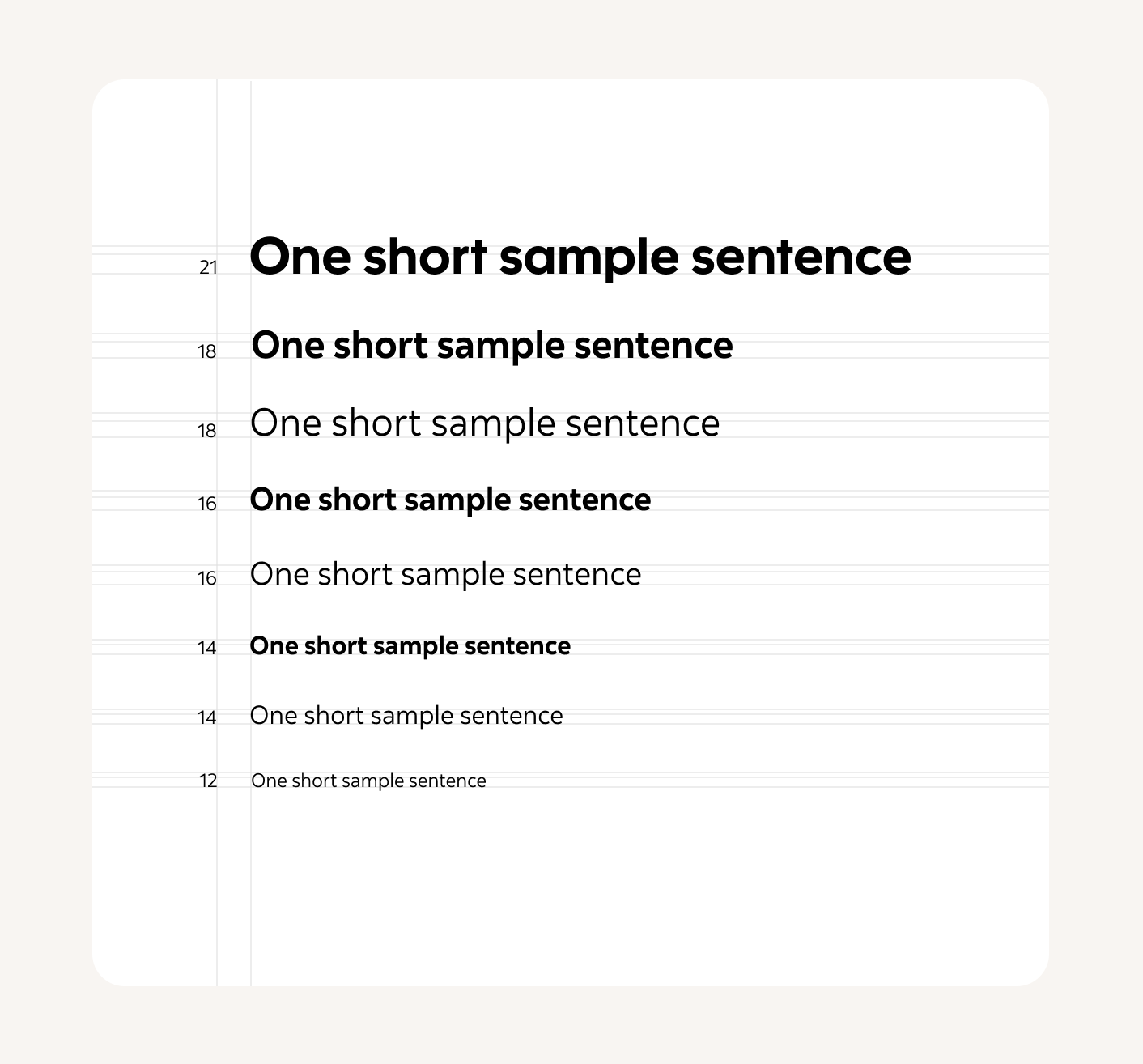
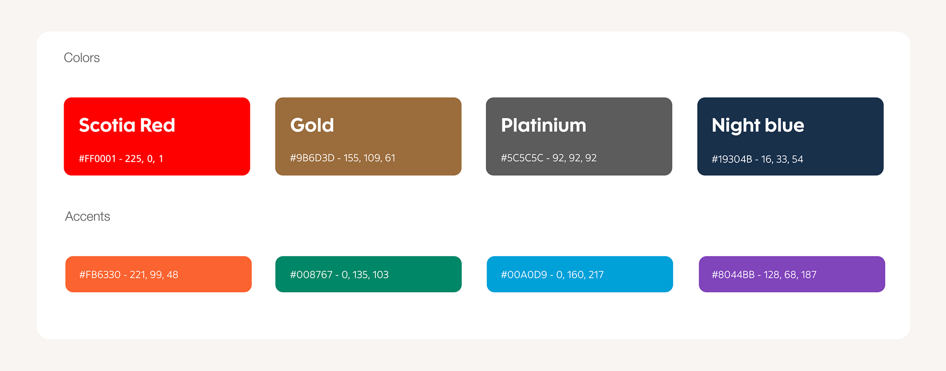
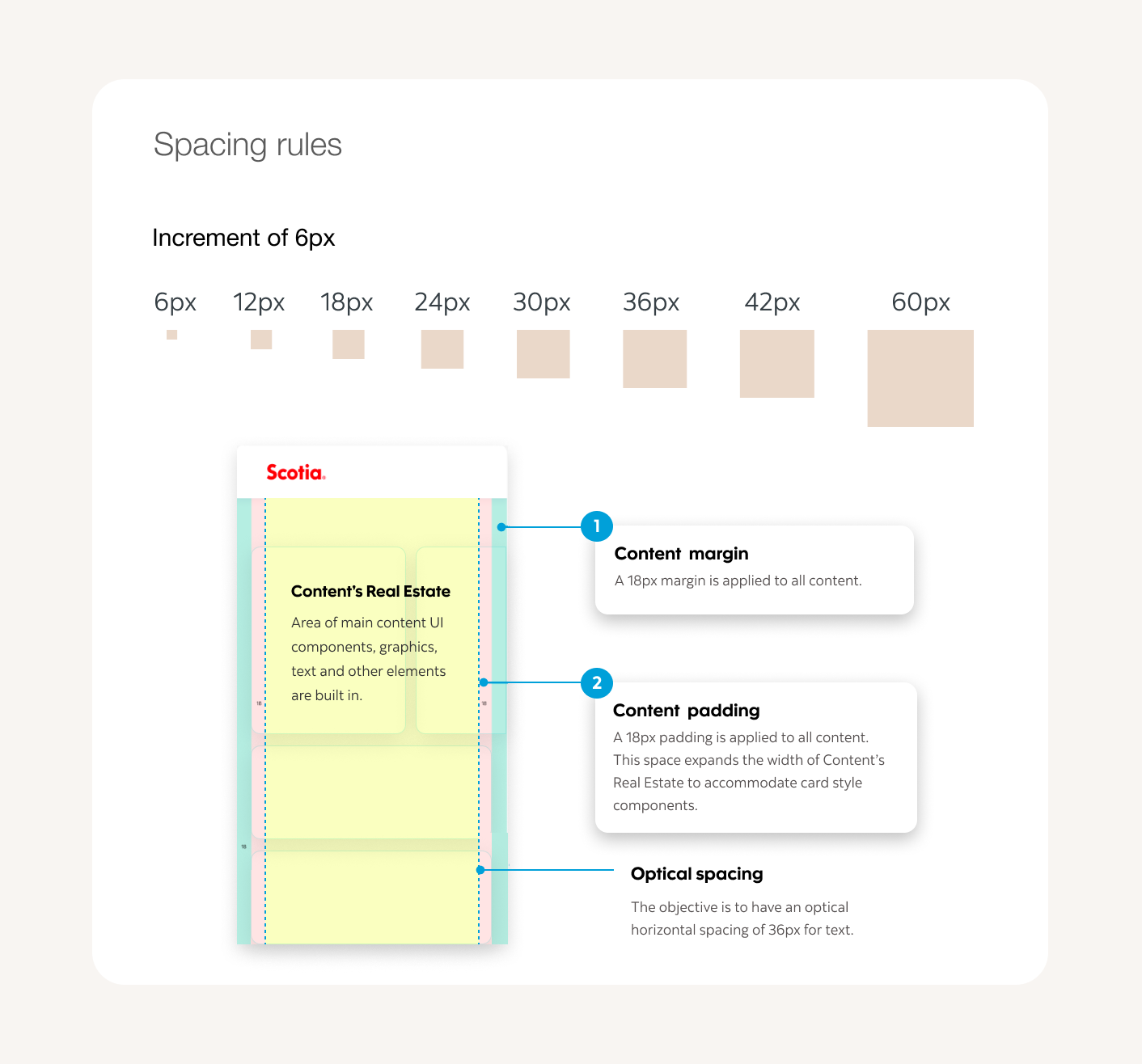
The foundation of success was rooted in leveraging the bank's existing design system. This system, established with the bank's brand personality in mind (think "reliable," "modern," and "approachable"), provided a strong foundation. Key guiding principles were extracted, informing refinements to the color palette, typographic hierarchy, iconography, and spacing guidelines specifically for the loyalty app. These refinements ensured a unified visual foundation tailored to the app's unique needs while maintaining consistency with the bank's overall brand identity.
Concurrently, a comprehensive sitemap for core content and features was created with navigation flows at the forefront. This content architecture ensured seamless integration with the existing design system while ensuring those interactions translated flawlessly to the interaction expectations of both iOS and Android users. Finally, core user interactions within the app were carefully outlined, ensuring actions like viewing rewards balances, navigating categories, or redeeming points felt smooth with clear analogs on each platform.
Concurrently, a comprehensive sitemap for core content and features was created with navigation flows at the forefront. This content architecture ensured seamless integration with the existing design system while ensuring those interactions translated flawlessly to the interaction expectations of both iOS and Android users. Finally, core user interactions within the app were carefully outlined, ensuring actions like viewing rewards balances, navigating categories, or redeeming points felt smooth with clear analogs on each platform.

Embracing Platform Nuances
A thorough understanding of Apple's Human Interface Guidelines and Google's Material Design was crucial, but the research went deeper than simply following the rules. The philosophies behind these design systems influenced choices around gesture interactions, animations, and the application of elements like shadow and motion cues.
Navigation patterns, which often varied between iOS and Android, received careful consideration. The number of top-level categories within the app, along with the potential for future expansion, guided decision-making. User surveys and moderated usability tests revealed a slight preference for a bottom tab navigation approach on iOS, aligning with the platform's conventions. For Android, where side drawer navigation was more common, the drawer was made easily accessible yet unobtrusive to maximize screen space.
Understanding how each platform handled the "back" action was critical. The navigation stack implementation was adjusted to ensure that the back button behavior on both iOS and Android aligned with user expectations, providing a seamless and predictable experience.
Designing with accessibility in mind was a non-negotiable. Careful consideration was given to screen reader behaviors, sufficient color contrast, and touch target sizes to ensure the app could be enjoyed by users with disabilities on both platforms. Accessibility audits were conducted during development to catch potential issues early.
Low-fidelity Wireframes for iPhone and Android
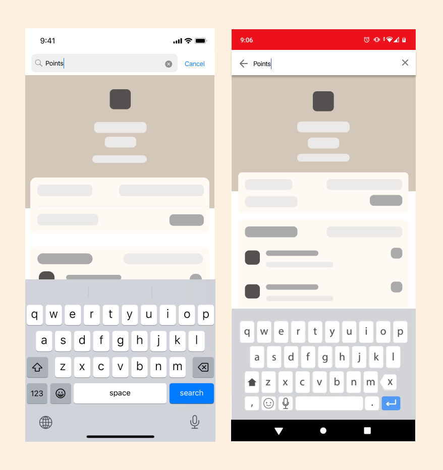
Search Function
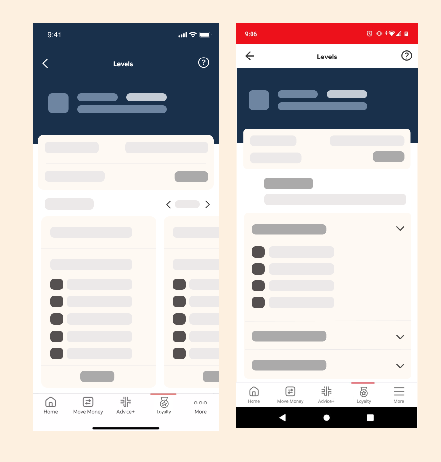
Carousel vs. Dropdown
Design Process
Early in the process, concurrent wireframing on both platforms proved invaluable for exposing potential friction points. For example, a carousel design that worked flawlessly on iOS felt awkward on Android; exploring alternative layouts ensured no loss of functionality.
Iterative prototyping was used heavily to address nuanced differences. Animation timing, haptic feedback within the rewards redemption flow, and numerous other elements were tested on both platforms and meticulously refined. User feedback highlighted a slight timing adjustment needed in Android animations to feel as natural as their iOS counterparts.
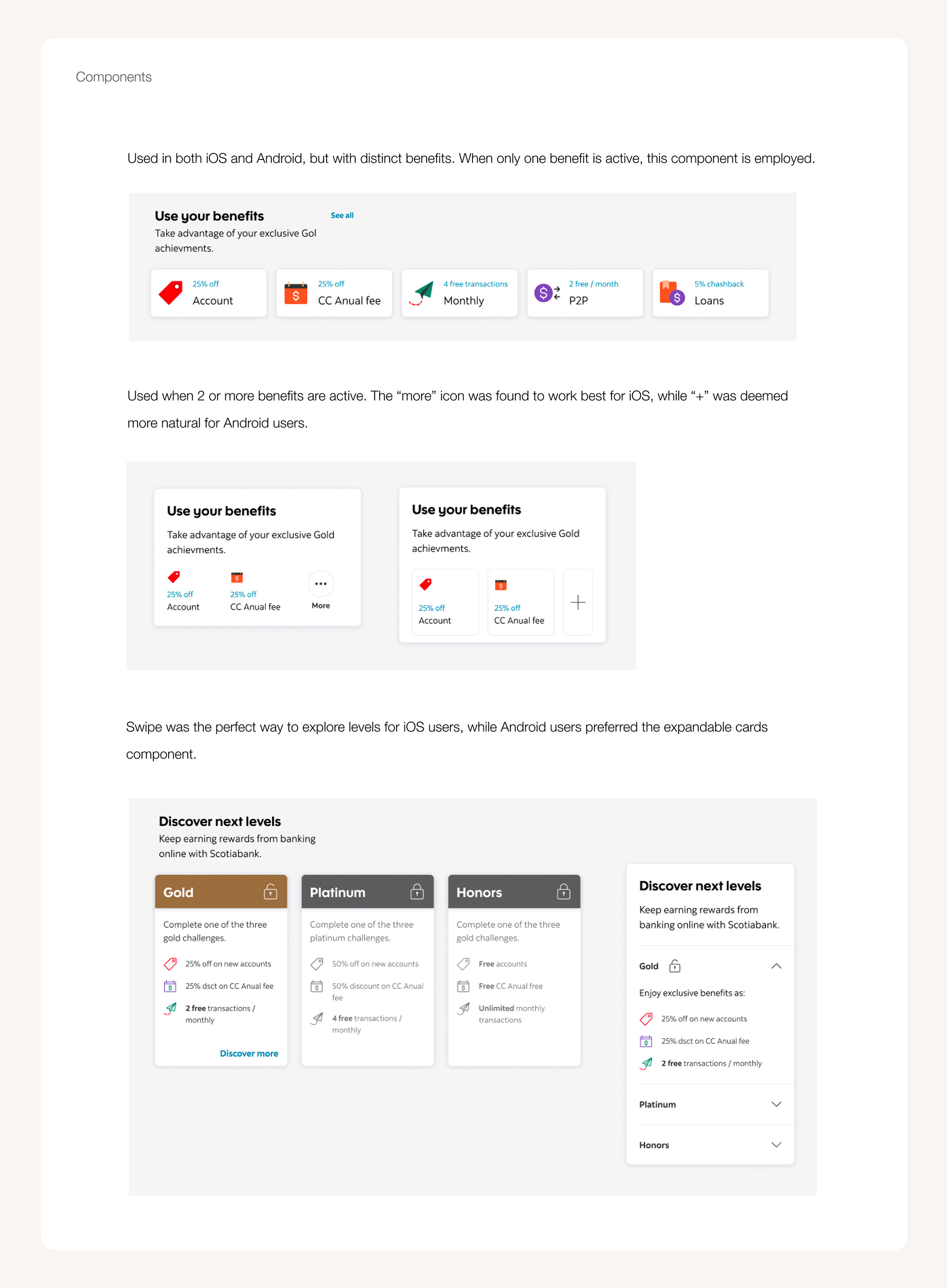
During user testing, an interesting discrepancy emerged. The rewards catalog, featuring a card-based interface on iOS, was well-received. Yet, participants on Android found the layout slightly overwhelming, preferring a focus on information density. To address this, an alternate list view with expandable cards was created specifically for Android. Iterative testing ensured this solution achieved both readability and a sense of visual appeal.
Cross-platform design tools like Figma, with their exceptional sharing and collaboration features, were essential for seamless synchronization between the iOS and Android design efforts. To streamline the process, we built robust component libraries specific to each platform. These libraries were built on a shared foundation, allowing for design consistency while allowing us to quickly create variations that aligned with the subtle visual and behavioral differences of each OS.
Iterative prototyping was used heavily to address nuanced differences. Animation timing, haptic feedback within the rewards redemption flow, and numerous other elements were tested on both platforms and meticulously refined. User feedback highlighted a slight timing adjustment needed in Android animations to feel as natural as their iOS counterparts.
During user testing, an interesting discrepancy emerged. The rewards catalog, featuring a card-based interface on iOS, was well-received. Yet, participants on Android found the layout slightly overwhelming, preferring a focus on information density. To address this, an alternate list view with expandable cards was created specifically for Android. Iterative testing ensured this solution achieved both readability and a sense of visual appeal.
Cross-platform design tools like Figma, with their exceptional sharing and collaboration features, were essential for seamless synchronization between the iOS and Android design efforts. To streamline the process, we built robust component libraries specific to each platform. These libraries were built on a shared foundation, allowing for design consistency while allowing us to quickly create variations that aligned with the subtle visual and behavioral differences of each OS.
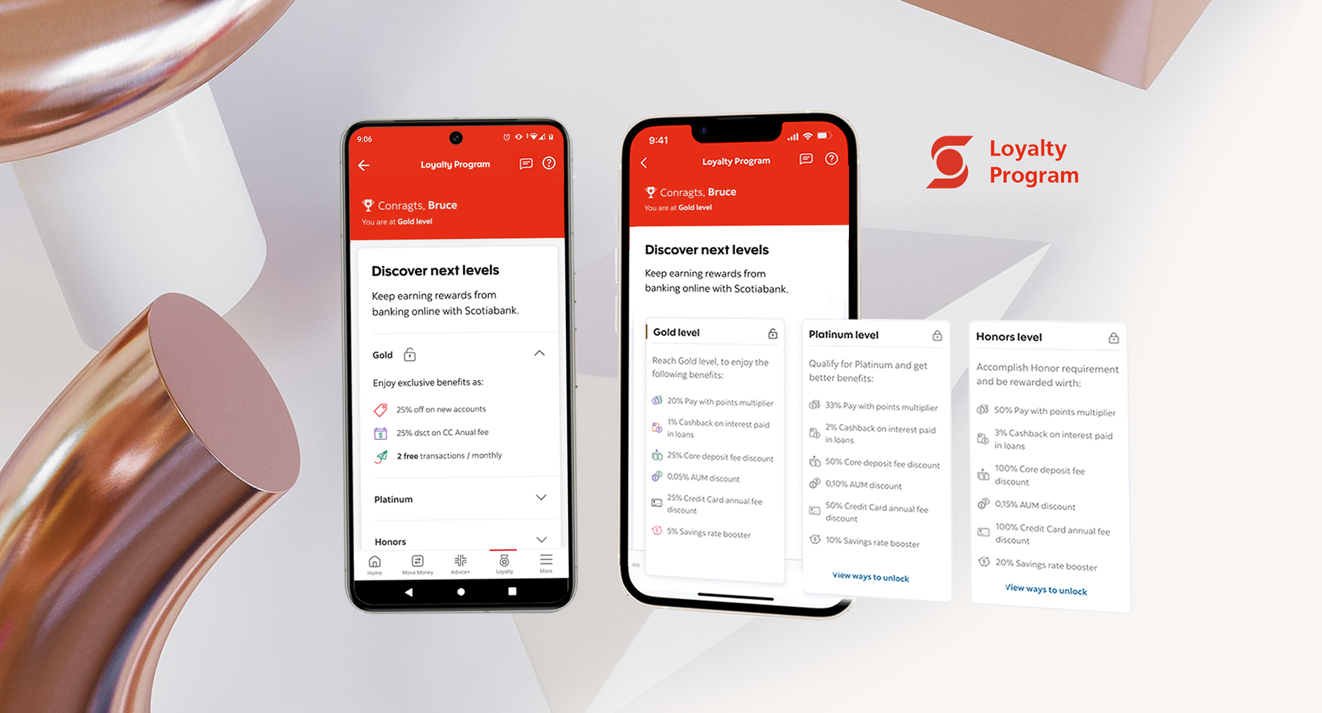
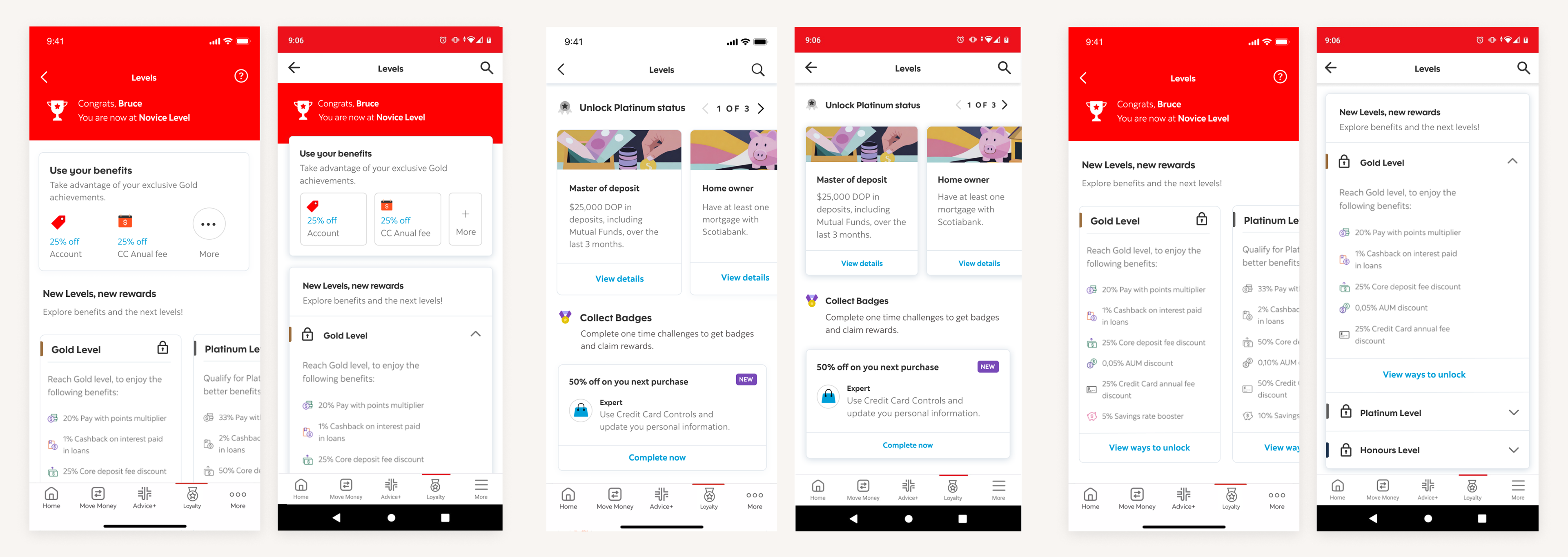
High-res screens
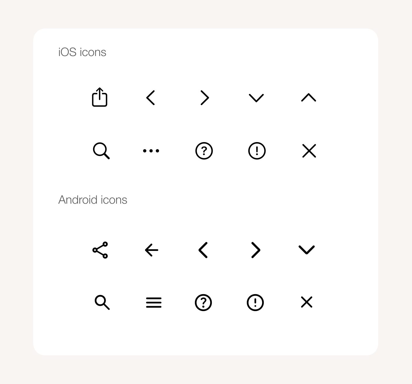
In these screen examples, we can clearly observe and compare the similarities and differences between iOS and Android in various aspects. These include iconography and target size, which influence the visual language and interactive elements; shadows and elevations, which create depth and hierarchy within the interface; spacing, which affects the overall layout and readability; and component versions, which determine the functionality and user experience.
Conclusion
This synchronized approach resulted in a banking loyalty app that felt cohesive, yet respectful of the unique paradigms of each platform. The key takeaway: this project reinforced the importance of iterative design, user-centered solutions, and an unwavering commitment to respecting platform nuances in the pursuit of a seamless user experience. Designing across iOS and Android is an ongoing dialogue between a brand's identity and the expectations users bring to their devices. It demands constant exploration and the willingness to adapt – not simply translating an interface, but carefully considering how interactions, animations, and the overall feel of the app can achieve the optimal balance on each system. True success lies in achieving an experience that feels both cohesive and undeniably native, continually evolving to meet shifting user needs and technological advancements.