Designing an Accessible Dark Mode Dashboard
Contrary to a popular belief dark mode does not equate to “accessible mode.” Dark mode doesn’t work for everyone. For some people, readability is better when the background is lighter and the foreground is darker. This preference is mostly seen in people with visual disabilities such as astigmatism, which makes reading difficult as it creates a blurry effect. For other people, dark mode is preferred because colors and images tend to stand out more, or make them feel less eye strain after long work sessions or for purely aesthetic reasons.
There are many considerations that designers need to focus on to ensure content meets digital accessibility standards. One of these standards is contrast. WCAG, the go-to for digital accessibility guidelines, established a minimum foreground to background contrast ratio. This is used to determine if elements have sufficient contrast and ensure readability of elements and text in the user interface.
The following case study highlights 3 main accessibility recommendations provided to Vynamic Security Suite (VSS). These recommendations were part of my effort to support developers during the process of building the dark mode for the VSS dashboard.
VSS is a zero trust-based, purpose-built product to protect ATMs and other self-service devices like retail point of sale. It provides a true 360° protection security solution to protect against logical attacks, threats, and inherent system vulnerabilities. Vynamic Security Suite delivers a trusted, serviceable and operational environment.
1. USE OF DATA VISUALIZATION
Dashboards usually consist of visual elements such as charts, graphs, and maps. The color contrast ratio plays a key role in data representation. To avoid accessibility issues and promote readability, colors should be carefully considered within these visual elements.
General recommendations
• Order groups by size for easier readability.
• Create a line between sections to increase readability
• Show all the categories, and disable not used categories.
• Avoid using the same colors for a different purpose than the graphic.
• Create a line between sections to increase readability
• Show all the categories, and disable not used categories.
• Avoid using the same colors for a different purpose than the graphic.
Recommended colors when using dark theme
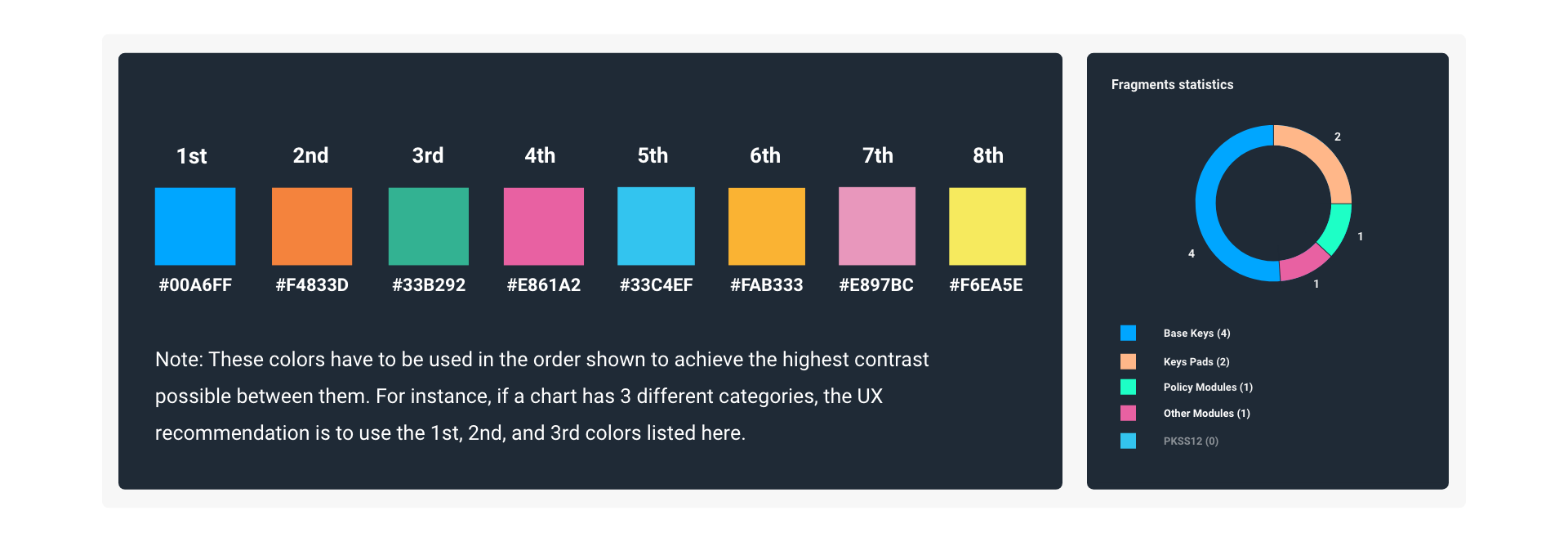
However, general color contrast principles are not all that needs to be considered. In reference to image above, the order in which the colors appears must be followed accordingly. For example, if you put color #1 beside color #5 the contrast ratio will not be high enough. As consequence, this will lead to misinterpretation of the data, or for some people even make it impossible to interpret.
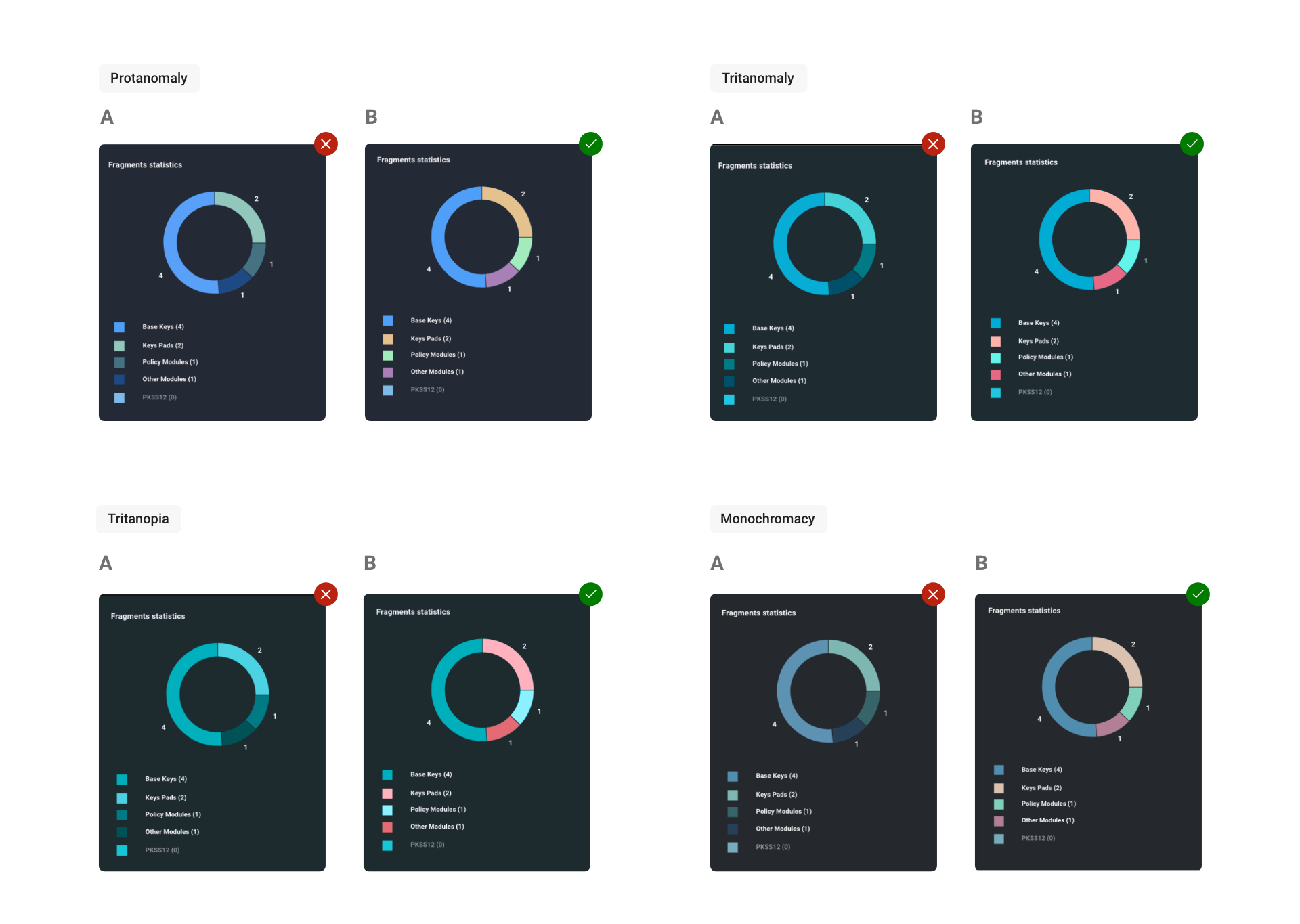
To illustrate the idea below, A is what the original colors of data visualization in this product were, and B are the recommended colors:
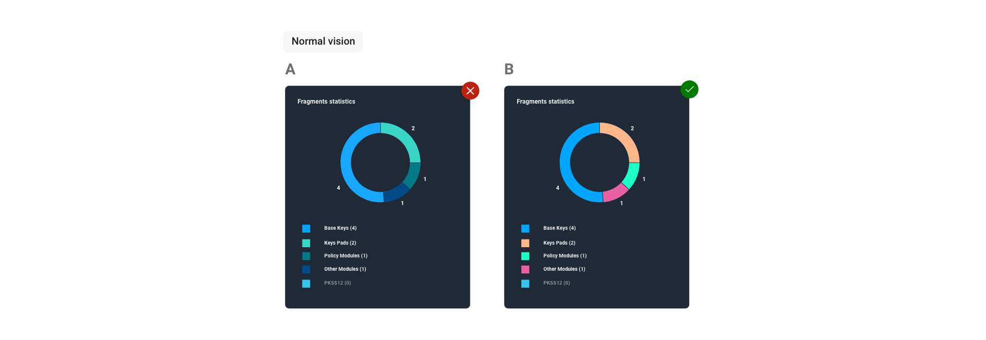
In the following images, you can see through the eyes of people who have color vision deficiencies such as, Protanomaly, Tritanomaly, Tritanopia, or Monochromacy. They display the differences choosing the right colors (B) can make for people that live with visual disabilities.
2. USE OF TEXT
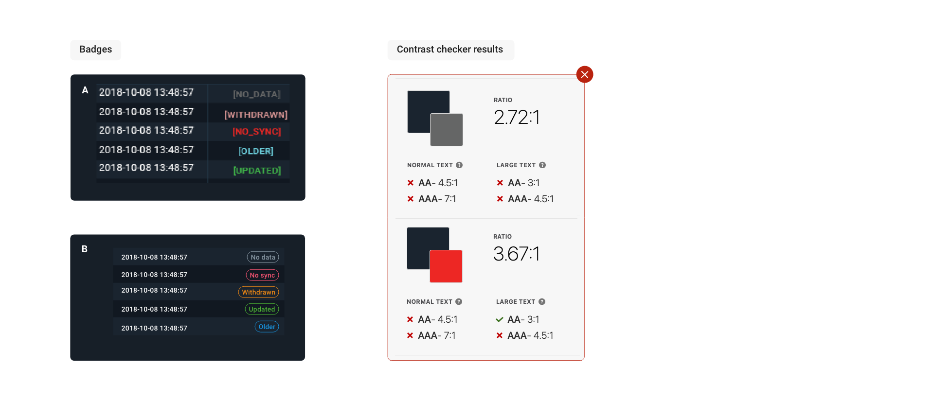
The most common accessibility standard (WCAG 2.1) requires that text also meet a minimum contrast ratio based on its size. Text that is 18pt (~24 px) or larger, or 14pt bold (~18.66px) or larger is considered large text. The minimum contrast for large text is a 3:1 contrast ratio. For small text, the contrast ratio is higher than 4.5:1[1]. In Dark mode, especially when the screen text is small, we should apply the highest contrast possible, this is typically why white text is default.
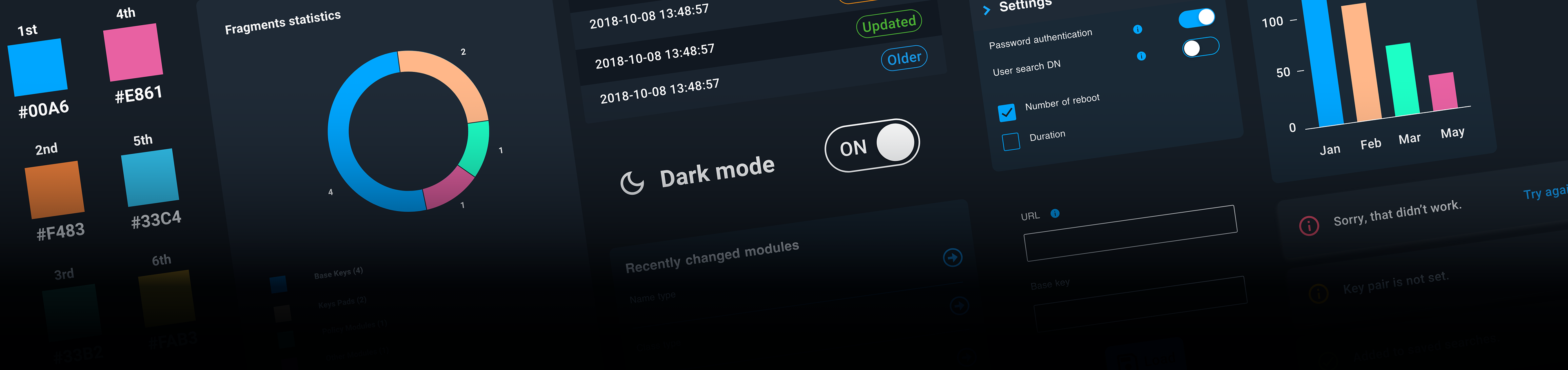
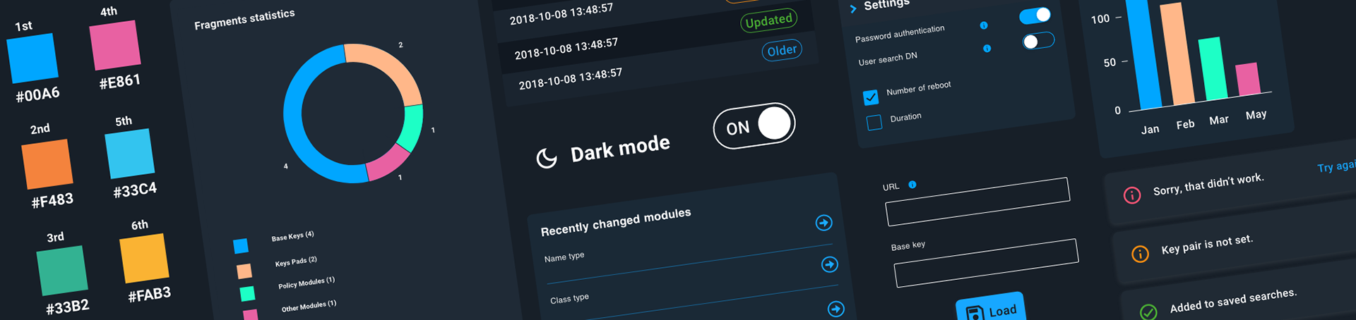
However, throughout the product we need to implement components, toast messages, badges, status, just to name a few. These components have text that sometimes requires different colors. Below, image A, shows the original dark theme where some colors for text didn’t meet the minimum requirement for its text size. B illustrates the recommendation of using colors with higher contrast that stands out even more in the dark backgrounds.
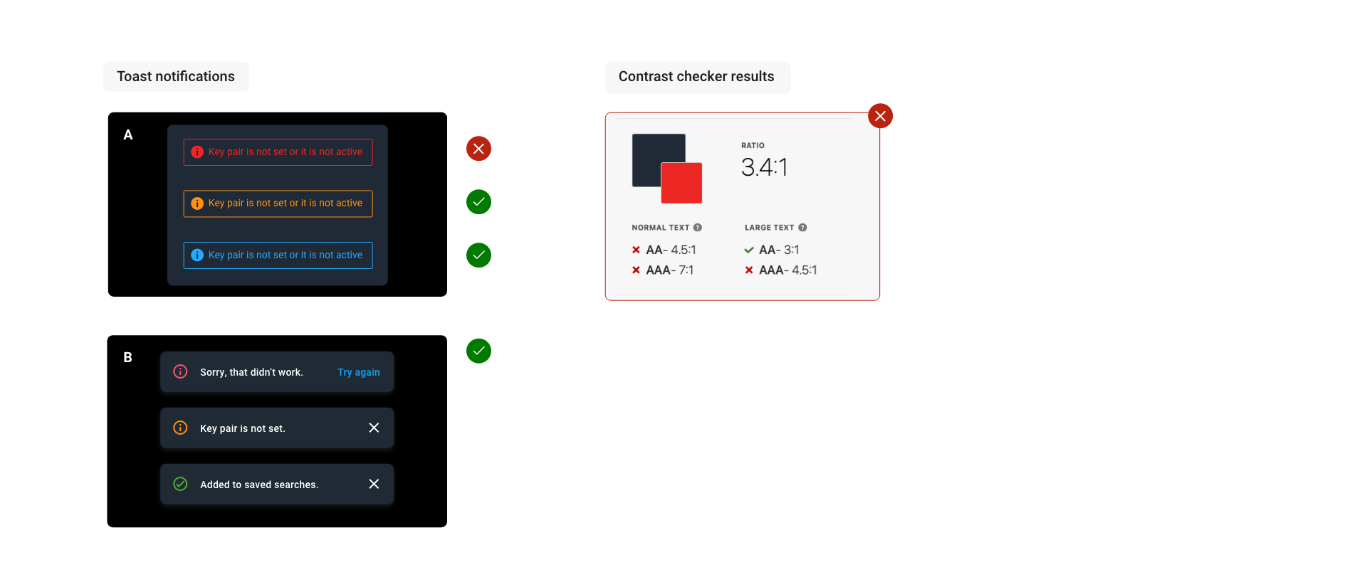
Toast notifications
Even though most of the toasts notifications passed the minimum contrast requirement for small font size, the recommendation is following the new Diebold Nixdorf Banking Guidelines in which toast notifications have white text for a higher contrast ratio. This also helps the user to differentiate between clickable (e.g., buttons) and non-clickable (e.g., text) elements.
3. USE OF COMPONENTS, ICONS AND GRAPHICS
The purpose of accessibility is to ensure that active user interface components (e.g., toggles, checkboxes, input fields) and meaningful graphics are distinguishable by people with moderately low vision.
Low contrast controls are more difficult to perceive, and may be completely missed by people with a visual disabilities. Similarly, if a graphic is needed to understand the content or functionality of the webpage then it should be perceivable by people with low vision or other impairments without the need for contrast-enhancing assistive technology [2].
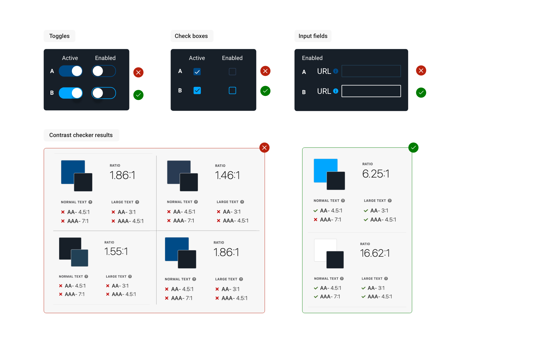
Toggles, check boxes and input fields
A didn’t have enough contrast between the background and the foreground. B shows the recommended colors to meet the contrast criteria.
Conclusion
These recommendations help to improve the accessibility of their dashboard in a dark mode by making it easier to read, understand and interpret. My goal at Diebold Nixdorf is to create great UI experiences with inclusion in mind, provide alternatives that allow the user to adapt to their accessibility needs, and also to accommodate their personal preferences. When including accessibility features and alternatives in our designs, we are also improving the overall user experience for everyone using the interface.
[1] https://www.w3.org/WAI/WCAG21/Understanding/contrast-minimum
[2] https://www.w3.org/WAI/WCAG21/Understanding/non-text-contrast.html
[2] https://www.w3.org/WAI/WCAG21/Understanding/non-text-contrast.html